Conversations with Design friends - Coco Price
Introducing the 1st in my 'Design Conversations' series where I share the chats I have with my creative friends.
Homeware designer Coco Price, has designed for the likes of Made.com, Kate Spade & Christies towels amongst other illustrious brands.
How do we know each other?
Isla: You did your MA at the Royal College of Art with all my St Martins BA textile degree friends and we all amalgamated into one friendship group.
Coco: I’d say we initially got to know each other gradually, bonding over industry stories, your cute style – including your gorgeous double-breasted preppy coats – and our shared experiences of getting the GWR train to the west country from Paddington. Now we chat on an almost weekly basis, which I always enjoy.
1.Mixing paint
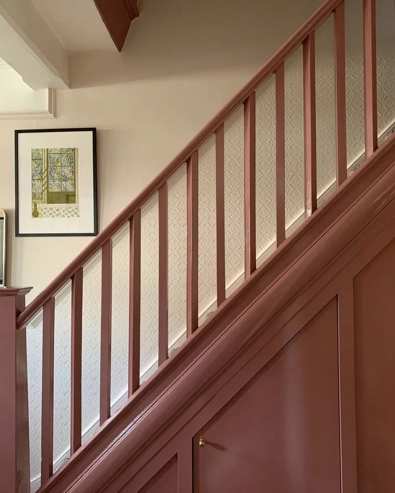
Isla: I think about your gloss pink woodwork all the time. You such a knack for mixing your own paint colours. What is your secret?
Coco: I have mixed my own paint colours for my home on several occasions and yes, you’re right, often pinks. I think it’s fair to say I am obsessed with the colour pink. I want it to capture a softness, something which conjures 1950s swans and ballerinas or fresh writing paper, and something which is just gentle and comforting.
When I’m in a room, I want the light to be shown off to its best and be really beautiful and clean; I want the colour to glow.
The reason I’ve ended up having to mix my own pinks is because I found, for my spaces, existing pink paints on the market did not capture the prettiness or sophistication that I wanted. The first pink I mixed was around 2012 and all the existing pink paints were either too Barbie and childish or a plaster pink in a very obvious way, containing far too much grey. I was looking for a warm pink with a slight yellow undertone, to create simultaneously the opposing feelings of both ‘warm’ and ‘fresh’ so the perfect balance was required to achieve this balancing act.
Some friends of mine, an artist and an architect, are working on a project in Scotland where they are building their forever home and they asked me to help them choose some paint colours for their spaces, which was a really fun experience and an honour as they’re both incredible with colour. They live in an area with a lot of green, rugged landscape, and so we turned to the rocks for inspiration: sandy pink colours, beautiful yellow/green citrine tones, and beautiful, beautiful greens. The home has Douglas Fir floors and beams, so all the colours we chose had to work with the Douglas Fir to bring out its beauty as well as looking at the light in the space.
2. Lipsticks
Isla: We constantly chat lipstick, I’m always searching for the perfect Hollywood peach, you mix your own. Why are we obsessed?
Coco: It’s the most impactful way to bring colour to your face. I often mix my lipsticks as well because, as you can tell, I’m very fussy with colour. My complexion has a bit of a sallow undertone so it’s not the easiest complexion to wake up. I am also obsessed with Elizabeth Taylor on every level as well as her make up. To find the perfect shade I often mix two or more lipsticks together. One I use straight from the tube is Charlotte Tilbury, sexy sienna, which is a peachy, nude colour on me. Pinky colours obviously look different on everyone, and on me it’s my perfect nude. I also love wearing really orange-reds; whenever I wear red it always has an orange undertone. I try to wear blue undertone pink lipsticks, like fuchsia or bubblegum but none of them EVER suit me. So what I do is mix them with with a small amount orange undertoned lipstick, and that seems to work on me. Lisa Eldridge make lipsticks which not only look like incredible, with beautiful colours and stunning textures but also the packaging is so special; I’m so excited because we’re planning to go on a Lisa Eldridge pilgrimage together, and try and all the colours, can’t wait.
3. Paintings in the home
Isla: When I come round I’m always asking you about the contemporary paintings in your house.
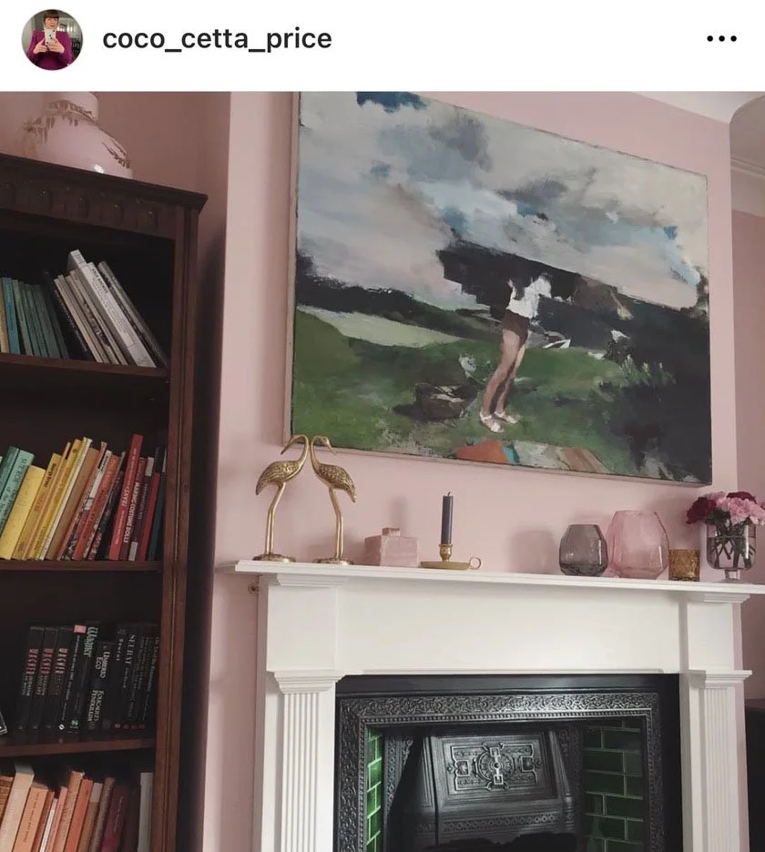
Coco: My husband is an art publisher and works with a lot of contemporary painters and artists, so we have been building a lovely collection of original paintings. This was not something I was used to having. I’ve learnt a lot about painting through him and there really is a quality and a depth to looking at colour as oil paint on canvas compared to a print or a poster, and I must say I do really enjoy having the original collection at home. Many of the painters are absolutely incredible with colour, as you can imagine. I place the paintings where I feel like the colours are going to contrast and spark or where tones are going to be picked up throughout the rest of the room. We also have a huge array of art books, many on the artists whose pieces we have. The thing we also enjoy is developing our collection over time. A collection evolves – it gets bigger, things move and change, so it’s a constantly evolving entity within our interiors. http://www.anomie-publishing.com/
4. Princess Margaret
Isla: How much do we love looking at photos of the Mustique years? And the photo of her and a young Susannah Constantine!
Coco: Oh absolutely, they are such gorgeous images of such a wonderful era. I absolutely love the Cecil Beaton photography era too. And the Christian Dior birthday dress that she wore, I was fortunate enough to see the dress in real life at the V&A during the Christian Dior exhibition, and it really transported me to that time;Princess Margaret really was such a magical spirit. She was beautiful and stylish and really captured the mid-century era, and she was a person who was on the social scene as well as a Royal, so she saw so much, it’s fascinating. I just love how she was a girl about town, and super fashionable at the time, as well as being the world’s most famous princess. She also, sadly, had a troubled life in the end in some ways, but we will always be PM fans.
5. Mrs Maisel
Isla: I still fantasise about the Saturday TV afternoon we spent watching Mrs Maisel and your husband brought us blankets and crisps. You have the best taste in films too.
6. Freelancing
Isla: I feel like there’s a book inside me on this subject, our friendship group is very candid, but not everyone has that support. Anything you’d wished you’d known?
Coco: To be honest, it’s still a mystery to me. I spent seventeen years working in large organisations as a designer. I did work as a freelancer when I was quite young and I’m freelance again now, which I’m really enjoying. With the experience I have now, it is a very different kettle of fish to freelancing when I was fresh out of the RCA, I really had no clue about the industry at all, there was no guidebook. There were very few useful Internet sites for how to freelance in the design and homewares industries when I started in 2006 – a different world! Back then if you didn’t know someone in the industry who could give you some pointers, it was just trial and error figuring it out.
Now there are so many online resources such as wikiHow and YouTube, you can read virtually any article by any person that has ever been written, whereas at the time it was very different situation. I designed a range of dinnerware for Habitat as a young designer. I was offered the option of a small design fee or no design fee and a 3% royalty instead, which seemed such a big gamble at the time. I could not afford to do a project for free, I was desperate to pay the rent. So I took the fee. The range went on to sell for ten years as one of their best sellers internationally, so it was a hard lesson to learn as a young freelancer – if you can manage to hold out for royalties, it can be worth the wait.
Follow @coco_cetta_price


